
How No Shifts launched their reimagined global brand
Branding / Logo design and SMM
Services We Offered :
About The Client
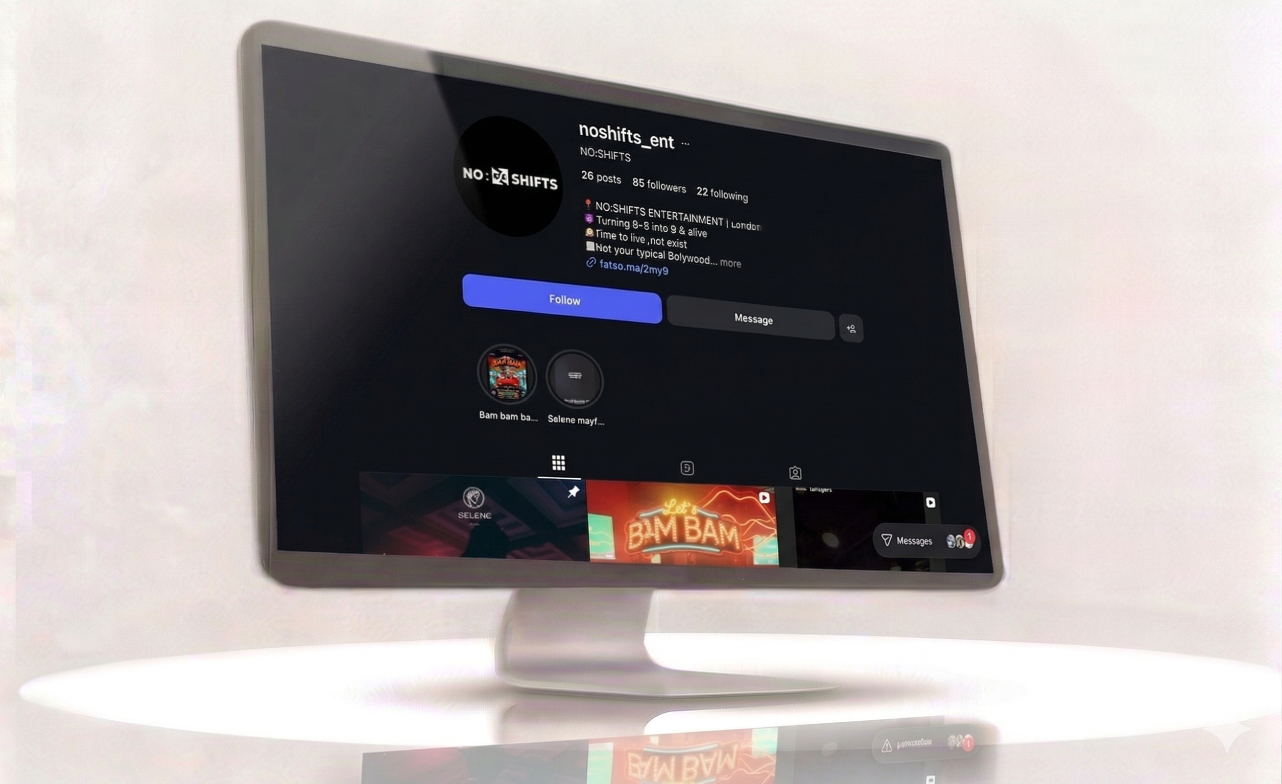
No Shift is a contemporary lifestyle and entertainment brand rooted in youth culture, individuality, and creativity. Based in India, the brand represents a new generation of thinkers and creators who express themselves through music, fashion, and community. With the tagline “Your vibe, your shift,” No Shift was envisioned as a movement - not just a name - where every design element and message resonates with authenticity and energy.
Technology Stack
Our Challenges
No Shift had a strong creative concept but lacked a cohesive visual direction. Without a professional logo, colour system, or typography style, the brand struggled to visually represent its individuality and energy across platforms.
The communication style was scattered - content lacked a unified tone that could connect with the youth-driven audience. This made it challenging to establish an emotional and cultural connection through social media messaging.
The brand’s social media activity was irregular and lacked a content framework. Posts were inconsistent in quality and message, reducing engagement potential and limiting audience retention.
In the absence of a standard design system, the visual elements used across campaigns felt disconnected. This inconsistency impacted brand perception and made it difficult to build long-term recognition.
The brand was publishing creative content but without clear analytics or performance benchmarks. This made it hard to evaluate what was resonating with the audience and where strategic adjustments were needed.
Our Solution
Crafted a minimalist yet striking logo that symbolised individuality and motion - the essence of the “shift” concept. Designed a complete visual identity system, including colour palette, typography, and layout principles, ensuring coherence across all channels.
Defined a confident, conversational tone that aligned with youth culture - expressive, engaging, and community-driven.
Developed a structured content strategy integrating lifestyle visuals, event highlights, and product storytelling. This approach not only reinforced brand identity but also positioned No Shift as an aspirational name in its niche.
Designed dynamic content templates, branded elements, and campaign visuals optimised for engagement and aesthetic appeal.
Implemented content analytics to measure engagement metrics, audience growth, and sentiment trends, enabling ongoing improvement and strategy refinement.
Results & Impact
Brand visibility increased by 75% , with consistent logo usage and cohesive visual identity across all touchpoints.
Engagement rates improved by 65%, , driven by creative visuals, relatable tone, and interactive campaigns.
Follower growth rose by 55% establishing a strong organic presence within the entertainment and youth community.
Content reach expanded by 60% , particularly through event and behind-the-scenes campaigns.
The brand now enjoys a recognisable digital identity, blending aesthetics, attitude, and authenticity - a perfect reflection of its community-driven philosophy.
UI / UX snapshots